
The system of traffic signs used in Britain after the Second World War was one that had been developed through years of tweaking and modifications, and had essentially evolved from the sign set introduced around the turn of the century. The War slowed this development (though one report on signing was produced at the height of the conflict in 1944), but as investment in transport picked up again, the system came under fire.
It was too old fashioned, the signs weren't noticeable enough, they were too wordy, and they gave prominence to route numbers, which at the time were prone to change from one year to the next, making many signs obsolete several times over.
The Ministry of Transport's response was to set up a new draft of the signing regulations that was intended to address these complaints, which was in many ways an implementation of the 1944 report. More symbols and pictograms were introduced, there was better use of colour on direction signs, and some information and restriction signs were altered to resemble the emerging conventions.
For example, speed limit signs now came with the numbers within the roundel rather than below it, and there was now a red circle with a white horizontal bar and the legend "NO ENTRY". In addition, some minor changes were made to the layout of direction signs and the details of the typeface.

However, the changes that were being made were not very drastic, and while the new regulations were still in draft form, the Ministry commissioned the Road Research Laboratory to set up some more wide-ranging experiments. Carried out in 1955, they examined some ideas that were outside the scope of the new draft, including the size and use of patches, the scaling of letters, and whether abbreviations could be used to allow larger letters without larger sign faces.


A demonstration of the advantages of increasing the height of letters - information presented much more clearly while using no additional sign width.

An unusual idea is tested here - highlighting the first four letters of place names. Obviously most place names have a common ending, so the first letters are the most recognisable, and this idea capitalises on that to save space. It is unclear how helpful this is in practice.

Using a sign of exactly the same dimensions, this example shows how stacking destinations is more efficient on space; in the bottom example the road numbers are split across two lines to maximise space usage even more.

The same sign area but a different shape shows how much more use could be made of the available space even where destinations are already stacked.

A prime example of the inefficient use the old-style signs made of space. The top example is mostly empty space, and the stacked examples below achieve two to three times the letter height on destinations with no extra sign space.

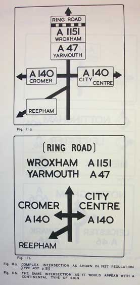
An attempt to stack destinations on roundabout signs results in some interesting arrow designs. The bottom sign is "Continental" in style, and is closest to what was eventually adopted.
Another example of the poor use of space. Simply by breaking out of boxes, the text can be made much clearer without losing the sense of the diagram.
The results of these experiment showed that, if nothing else, the existing system failed to make good use of space on large road signs and that there was plenty of room for improvement. But the results could only ever feed into future changes. The draft regulations went through regardless, and Britain was stuck with the same set of signs for the foreseeable future.
