Road signs are a very formal and organised business. If you want to erect one - and you have to be a highway authority to do so - your sign has to conform to the correct set of approved designs and patterns, which are published by the Department for Transport and produced with the benefit of a huge amount of scientific research and professional graphic design.
What you can't do is just make up your own signs and use those instead, on the grounds that you think they look nicer. But that's exactly what happened in the late 1950s when the County Surveyor of Oxfordshire took it upon himself to give his roads a more modern set of direction signs.
Sparks were bound to fly. But what is perhaps most surprising is that his signs were rather good, and in many ways were a little ahead of their time.
Most unlikely
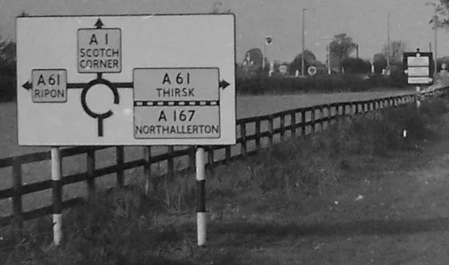
Until the modern set of road signs were introduced in 1964, following the recommendations of the Worboys Report, direction signs in the UK were based on standards set down in the early 1930s. They were clear and informative, and were rather distinctive as a piece of information design, but not terribly efficient in their use of space.
Like anything else of public concern, they had their supporters and their critics. One Mr K. Summerfield could be considered one of their fiercest critics, and as County Surveyor of Oxfordshire, he was in a position to dabble in some subversive rule-bending now and then. Until 1964, road sign designs were not set in law and were simply guidelines, and he exploited this in order to erect a set of direction signs to his own designs.
Many were on county roads, but they came to the attention of the Ministry of Transport when he installed fifteen of them on a section of the A40 trunk road east of Oxford. Feathers were ruffled at St Christopher House.


Indignant correspondence was sent off to Oxfordshire County Council as soon as the Ministry caught wind of the signs. The main problem seemed to be that they did not conform to the regulations, but the engineers in London were also very concerned that they were badly designed. They were white on a black background - a complete reversal in colour scheme - and they were, horror of horrors, "Continental" in layout. Having reviewed some photos sent by the divisional road engineer, one wrote:
"[Some of the signs] seemed most unlikely as future prospects, for example a sign having letters with a 4" body height using a plate 20" deep for a single word, compared with a 9" plate height recommended by the Minister and approved by the Royal Fine Art Commission."
Unfortunately, the Ministry couldn't actually do anything about it other than write blustery letters. The County Council was their agent for trunk roads in Oxfordshire, and while they could prevent the County Surveyor from charging the cost and maintenance of the signs to the Ministry of Transport, they couldn't make him take them down because the regulations were only guidelines.
More comprehensive information
In response, the County Surveyor continued erecting the signs out of his own budgets, and submitted an eloquent three-page rationale to the Ministry in 1957. In it he stated that the signs were "designed for use on major routes in rural areas carrying heavy volumes of fast traffic". He wrote:
"The basic principle of the system is the use of separate signs to describe the through route and the side turnings...
"Each sign having a single purpose, a simpler layout is possible than in the conventional sign, and its message can be more easily assimilated. It follows that more information can be provided on each sign than is possible at present.
"The system allows the number of direction signs to be reduced, whilst at the same time providing more comprehensive information than is given at present."

The County Surveyor was actually doing something rather more unusual than that. He was using distance signs - recommended in 1964 by the Worboys Committee - to show the route number and distance to towns and cities, which were placed after junctions, just like today. He applied lowercase lettering, so towns had their names in capitals and villages were named in mixed-case. He prioritised place names over route numbers, when the existing road sign system called for the opposite. And he devised a number of concise and clear symbols to indicate direction that were an odd hybrid of map and arrow.
Despite their initial rejection by the Ministry of Transport, the signs were actually rather well designed. Seen side-by-side against the regulation sign that was supposed to be used, and the Worboys equivalent that would be introduced in 1964, they compare very favourably. In fact what is most noticeable is how much they resemble Worboys signs in their style and layout.
Oxfordshire's signs were, it seems, highly experimental. The lettering differed slightly from one sign to the next, probably because their designers were trialling different ways of matching lower-case lettering to the all-capitals alphabet used on normal road signs.
The argument rumbled on into 1960 - with Oxford City Council now erecting signs to the same design on the city's new Eastern Bypass, and the county of Oxfordshire looking set to become an island of renegade signposting experiments. It was clear, even to the Minister, that the signs were not going to be removed any time soon, and a deal was struck whereby they would be retained, with approval from the Ministry, to be used for Road Research Laboratory experiments, and on the condition that no more signs of that type would be erected any more.
Causing confusion
It was known by then that the Worboys Committee was already mulling over the design of direction signs, and indeed the Oxfordshire signs get a mention in their work: on page 31 of the published report, they note that they thought Oxfordshire's black was "funereal". It seemed appropriate - if not oddly coincidental - that the RRL could make use of the signs for their research into the design of direction signs. In fact, the whisper from the RRL that the signs might be useful came so soon after the Ministry's first unhappy letter that you have to wonder whether they were in cahoots with the County Council from the beginning.
What actually happened, despite the Ministry's hopes that this would stem the tide of mutinous signs, was that Oxfordshire County Council continued to do whatever they pleased. More of the signs continued to spring up on their county roads as the years went by.
After the publication of the new Traffic Sign Regulations and General Directions (1964), the Ministry was very keen to get shot of the unconventional signs that now littered the county, and a Mr E. Ede, Divisional Road Engineer for the South Midlands, expressed no small amount of concern that "they might well be causing some confusion because they might appear to many drivers as being a special type of new era signs which for some reason do not fit into the primary route category." This seems as close to an admission as there would ever be that Oxfordshire's signs were ahead of their time.
Nonetheless, it was noted that while the A40 was fast-tracked for sign replacement, many of Oxfordshire's signs were on non-primary roads and funds wouldn't be freed up for years to replace them all. There are suggestions that one or two of them survived into the 1990s - but they are now, sadly, all gone.
Sources
- Information on this page is principally sourced from National Archives file MT 95/201.


